Color Scheme: We introduced a new color scheme featuring blue as the primary color and red as an accent. Blue was chosen for its calming, reliable, and professional qualities, creating a soothing user experience while enhancing trust and engagement. Red was used sparingly to highlight important elements and calls to action, ensuring visual hierarchy without overwhelming users.
Typeface: Open Sans was selected for its high readability and versatile application across various devices. Its clean and contemporary design ensures clarity even at smaller sizes, making it suitable for both web and mobile interfaces.
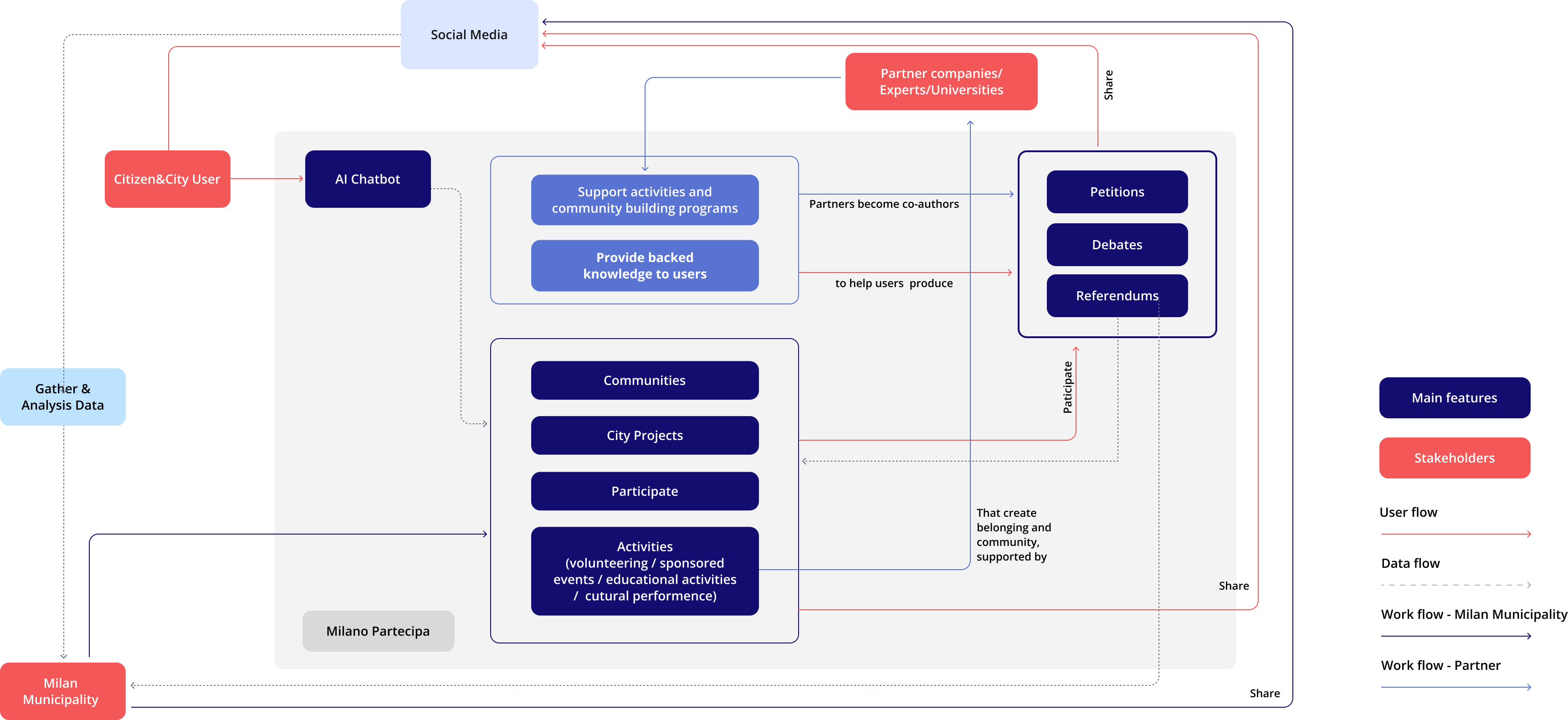
UI Structure: We employed a card-based design to organize information into visually distinct, digestible chunks. This approach facilitated easy scanning and navigation, adapting well to different screen sizes and orientations.
Prototyping and Deliverable: We developed wireframes and high-fidelity prototypes to visualize the platform’s design and functionality. The final deliverable included a homepage designed to facilitate user familiarization with the platform’s content, featuring a direct shortcut to the chatbot and dedicated card sections for key features. We ensured consistency across touchpoints by aligning the website’s structure with the app, allowing for a seamless user experience between the two.Throughout the design and testing phases, iterative feedback was used to refine the prototypes and ensure they met user needs. This process culminated in a final design that addressed usability issues and enhanced overall engagement with the Milano Partecipa platform.
.png)


.png)


.png)

.png)
.png)
.png)
