Algorithmic Trading Platform Redesign
As the lead designer for this project, I focused on optimizing usability, interaction, and user engagement for a diverse audience, ranging from novices to expert algorithmic traders.
The Role
I spearheaded the redesign efforts, leveraging user insights and competitive benchmarking to create a scalable, user-friendly interface that drives engagement and conversion.
Key Contributions
- Conducted in-depth heuristic evaluation and SWOT analysis to identify opportunities for improvement.
- Redesigned the dashboard, strategy creation flow, backtesting interface, and bots section to enhance usability.
- Introduced personalization, gamification, and dark mode to improve user satisfaction and retention.
- Developed features catering to both novice and expert users, including dual-mode strategy creation and contextual tooltips.
Results at a Glance
The redesign achieved:
- Improved engagement through innovative features like gamified rankings and customizable dashboards.
- Enhanced user satisfaction across all personas.
- Increased usability by implementing intuitive flows informed by Maze usability testing, including improved hierarchy and better CTA placement.
- Strengthened user conversion with targeted prompts and premium feature highlights.
Understanding the platform
To initiate the redesign, we conducted an in-depth heuristic evaluation of the existing platform to identify usability issues and areas for improvement. This evaluation revealed several key pain points, including inefficient space utilization, lack of intuitive navigation, and unclear visual hierarchy. Additionally, we performed a SWOT analysis to benchmark the platform against competitors, uncovering opportunities for differentiation and areas requiring parity with industry standards.
Key Insights:
- The platform struggled to cater to both novice and expert users, creating friction in user adoption.
- There was significant potential to incorporate gamification, dark mode, and personalization to enhance engagement and usability.
- The strategy creation flow was overly complex, especially for new users, highlighting the need for a more digestible and scalable approach.
- Cognitive load issues, such as overwhelming amounts of data and lack of onboarding, were key barriers to user success.
Heuristic Analysis
Competitive Analysis - SWOT Matrix

Defining User Personas and Goals
We identified three core user personas to guide the redesign process:
- Rookie: Users unfamiliar with algorithmic trading, needing a simplified interface and educational support.
- Familiar: Users with basic knowledge, requiring a mix of simplicity and customization.
- Expert: Experienced traders who value advanced tools and maximum flexibility.
Objectives
- Enhance usability across all user personas while maintaining advanced features for experts.
- Create a cohesive platform that integrates dashboard analytics, strategy management, backtesting, and live bot trading in a seamless user journey.
- Foster user conversion by highlighting key premium features and offering clear upgrade pathways.
- Address cognitive load by breaking workflows into manageable steps and incorporating onboarding and contextual guidance.
How might we redesign an algorithmic trading platform to cater to diverse user levels while streamlining strategy creation, backtesting, and bot management?
03 Developing the concept
Design Concept
The overarching concept was to redesign the platform to optimize usability and interaction while aligning with modern design and user experience standards. Here’s how we approached each major section:
1. Dashboard
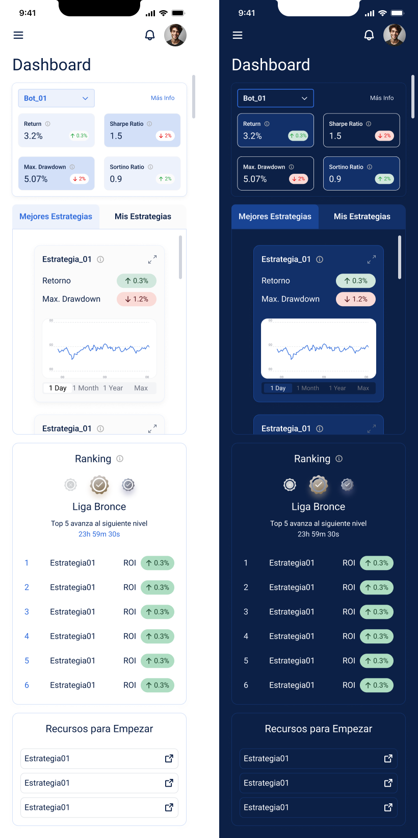
We prioritized space utilization by grouping live strategy performance data and featuring top-performing strategies through gamification elements.
Users could:
- View daily updated rankings based on metrics like return, max drawdown, and other KPIs.
- Customize their dashboard by adding or removing metrics relevant to their trading style
- Introduce dark mode to reduce eye strain and align with user preferences for nighttime trading.
.png)
2. Strategies
The strategy hub offered:
- A summary section for user-created strategies and available templates for rookies.
- Dual modes for strategy creation:
- Basic Mode: A rule-builder interface, allowing users to create strategies using standard parameters (indicators, actions, operations).
- Advanced Mode: A node-based system for visualizing strategy connections, designed for experts.
- The strategy creation process was broken into three digestible steps, simplifying onboarding for new users while maintaining flexibility for experts
- A folder system for experienced users to organize strategies more effectively.

3. Backtesting
We streamlined the backtesting flow by:
- Including a strategy summary to provide context before initiating the test.
- Distributing inputs clearly, from strategy selection to time range specifications.
- Adding shortcuts for quick edits, ensuring an efficient testing process.
- Clearly differentiating dynamic data (e.g., test results) from static data (e.g., strategy details) to prioritize actionable insights.
Maze usability testing highlighted that button placement and hierarchy improvements were necessary to guide users toward creating bots organically. These adjustments included repositioning CTAs and refining interactive metrics.During backtesting, users received direct performance results with visual projections and downloadable graphics. Tooltips provided additional guidance to new users.

4. Bots
The bots section allowed users to:
- Link bots to specific strategies and run them live in the market.
- Monitor performance seamlessly, bridging the final step in the user journey.
Conversion Optimization
To promote user conversion, we incorporated toasts and banners at strategic points (dashboard, backtesting, bots) that highlighted premium features available through paid plans. These prompts were designed to align with the user’s current workflow, ensuring minimal disruption while maximizing engagement.

.jpg)
Outcome
The redesigned platform delivered:
- Increased engagement through gamified elements, personalized dashboards, and the introduction of dark mode.
- Enhanced satisfaction for both novice and expert users, as evidenced by post-launch surveys.
- Improved task efficiency due to user-centric design adjustments informed by Maze usability testing.
Key Learnings
- Balancing Simplicity and Advanced Features: Breaking complex processes into smaller steps and offering dual modes (basic and advanced) catered effectively to a diverse user base.
- Gamification Drives Engagement: Highlighting top-performing strategies fostered a sense of competition and community among users.
- Context is Key: Including tooltips, summaries, and shortcuts throughout the platform significantly reduced friction and improved user confidence.
- Guided Interaction Improves Outcomes: Refining hierarchy and CTA placement encouraged organic user flows, as evidenced by Maze usability testing.
Next Steps
- Expanding educational resources for rookies.
- Enhancing real-time analytics for expert users.
- Exploring AI-driven insights to further personalize user experiences.
- Integrating further gamification and collaborative features to boost engagement.
Onboarding
Profile & subscriptions

Dark Mode & Node System

Want more details?
Let's chat! I'm always down to discuss my work and brainstorm new ideas
linamauseche@gmail.com

.png)
_page-0001-min.jpg)

_page-0001.jpg)
.png)


.jpg)
.jpg)
.jpg)


